
You are currently browsing the tag archive for the ‘buffs’ tag.
When I first installed Satrina Buff Frames it’s main purpose was to patch over the shortcomings of the otherwise very pretty SpartanUI, putting the buffs back in the top corner of the screen instead of making my eyes bleed trying to squint at the tiny space given to them by the fancy all-in-one-combined action bar. Any thoughts of what else it could do were immediately ignored and, to be frank, considered strange, alien and scary; separate frames, filters, lions, tigers and bears? Oh my!
But nothing breaks through that comfort zone like an emerging problem, this being that when tanking an instance, it’s very easy to lose my standard three druid buffs amongst the milieu of others bestowed upon me by my team-mates. I need to know, at a glance, exactly where I stand with Thorns and Omen of Clarity particularly, and when my Gift of the Wild runs out, then I know everyone else’s has as well.

Currently I had the default two frames, one for buffs and one for debuffs. A third frame was created and filters dropped in to show any buffs containing the strings “of the wild”, “thorns” and “omen of clarity” (using the suffix “3:n~”). Since I know it will be just these buffs, I could limit the number of buffs shown to four (three wasn’t an option) and have them displayed as tidy bars with a width of 200px, and lo:

Instant visual gratification, all kept tidily in the top corner of the screen! Lightly garnish with disabling the buffs from being shown in frame one in the Spells tab, and never again may I start on clouting a pack of mobs only to realise that Thorns expired some time ago.
Satrinas Buffs Frames. It’s what’s for dinner!
(edit: on writing this i thought “hey, what about aspect of the wild? eh?” and so the filters have been modified so that any nature-concerned hunters I may travel with don’t mess up my tidy bars) :p
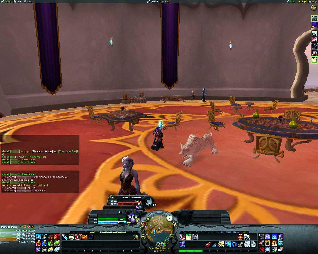
SpartanUI v2 is finally out with all rewritten code and it’s lovely, all that once occupied all four corners of the screen is kept tidily at the bottom leaving a glorious wide-open space of world-view to enjoy. It has, however, a few annoyances that are par for the course with any beta.
Let’s start with the personal buffs bar. Currently shown as a tiny space between my own and pet’s portrait (can you see it? Squint a little, it is there), it has about enough space for about eight buffs, no sign of any remaining duration and any that don’t fit into the area are just… not shown. I’m reliably informed that it’s possible to move the buffs to their usual place in the top-right of the screen and, I’ll be honest, this is where I want them. In fact, the same reliable informer tells me it’s possible to move anything anywhere you damn well please, although exactly how to do this is not made entirely clear, not in the Bartender3 menu, nor any supporting documentation files within the ZIP.
A similar buff-bar is shown above the currently targeted mob’s portrait which would be acceptable, except that no debuffs I place on any mob are currently shown at all. Wing clip, serpent sting, immolation trap, nothing, I’d be completely in the dark were it not for Kharthus’ Hunter Timers.
Prompting the question, “Hey, did any hunters at all make their way onto the private testing list?”, when activated, the mend pet icon appears, wait for it, right over my pet’s health percentage. That’s, like, obtusely inconvenient, especially when I can’t see her health bar anyway! Also completely invisible: The latency bar. Look at the space available at the bottom-left of the mini-map, that would be a perfect place to put a pretty, countersunk circle of either green, yellow or red.
Wrapping up the cons, it seems that when summoning or reviving my pet she has an invisible health bar which is no end of stress, and finally, it has major problems working with DoubleWide for the quest log. The height-boosted one it comes with is better than Blizzard’s and works well for crafting windows but doesn’t quite trump DoubleWide for easy-quest reading. Okay, this is essentially nitpicking while I’m on the negative flow, I’ll live with it.
On the plus side, the extra bar space has removed my need for my long-standing add-on favourite NumPadBar, Recount fits nice and snug into the blank space to the bottom left and, particularly impressive since it’s something I’ve wanted to have for a long time, a key-bindable function to toggle the size of the chat window. No more will I have troubles keeping up with what people are saying between fights in raids or instances, a quick press of “Y” and I get four times the space in glorious TallVision(tm), press it again and we’re back to the original size and ready to shoot stuff. This, it has to said, is a deal-breaker.
Also welcomed with a loud “Elune be praised!”, the directional arrows and North indicator on the mini-map are pushed in from the edge just a little bit. It doesn’t sound like much, granted, but with the growing number of add-on icons and other flulff also making a home around my map, travelling in certain directions it had become nigh-on impossible to know exactly where north was, leading to a strong case of Quickly Check The Main Map To Find Out That I’m Actually Travelling In The Opposite Direction syndrome.
More for the “It’s The Little Things That Count The Most” file, when you go AFK the camera smoothly pans around your character, takin’ in the surroundings while you’re off doing something probably less productive, and the reputation bar shows whatever faction you last gained rep for, no more manually changing it when grinding for the love and appreciation of various groups.
Biggest plus of all, well, just look at it. Compact, neat, tidy and lovable enough to stick around. Okay, it’s still a beta, give it time, just let me get my buffs somewhere visible again. One thumb up with the other safely in the post for after the mini bug fixes.
